
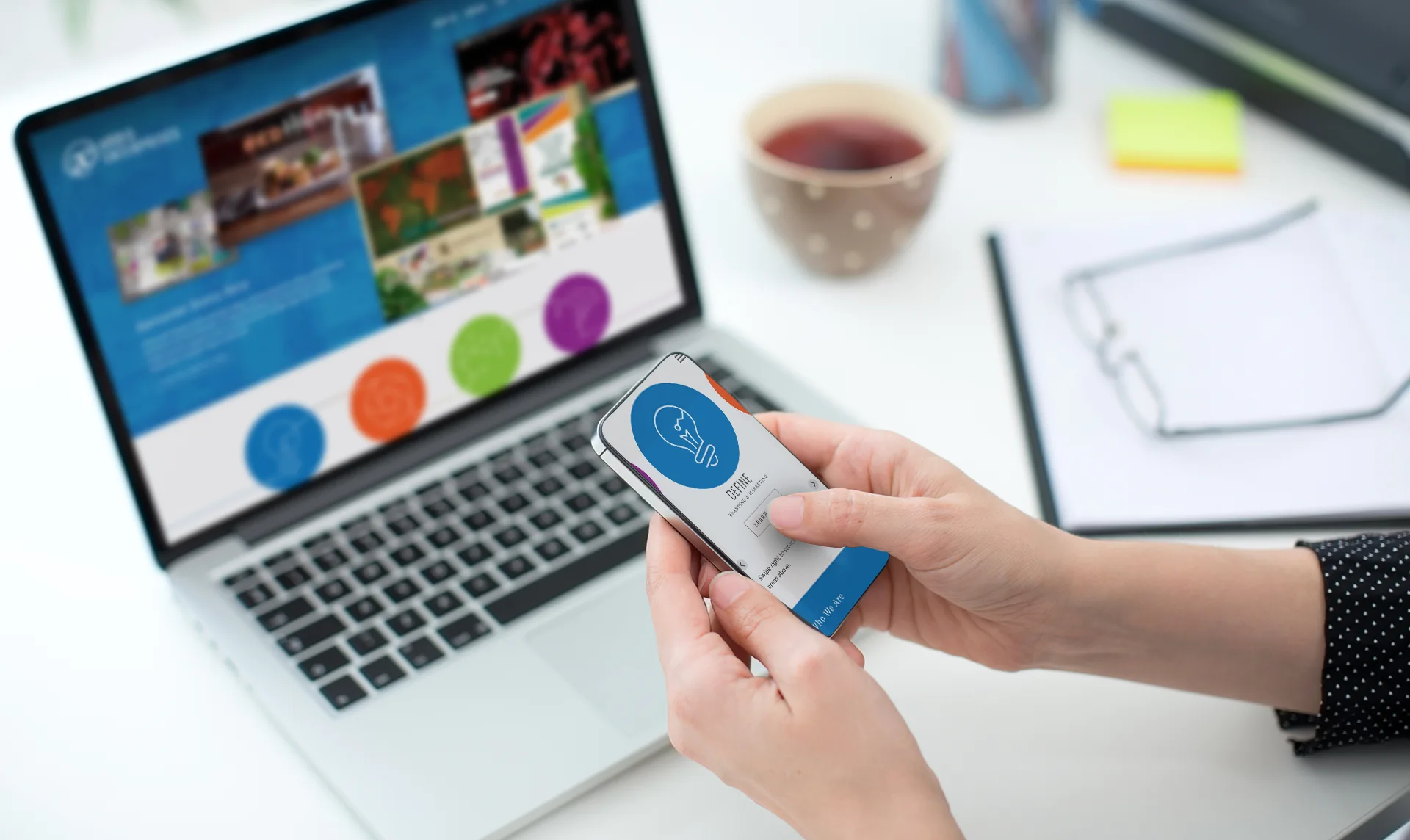
Mobile-First: Why Your Phone is the Most Important Screen for Your Business
More people than ever are visiting websites on their phones, making a mobile-first approach essential for businesses. Learn why designing for smaller screens first leads to faster, clearer, and more effective websites that keep customers engaged.
Mobile-First: Why Your Phone is the Most Important Screen for Your Business
More people than ever are visiting websites on their phones, making a mobile-first approach essential for businesses. Learn why designing for smaller screens first leads to faster, clearer, and more effective websites that keep customers engaged.
Websites and digital tools are often built and tested by developers sitting at desks, looking at large computer screens. But here is the reality check: many people interacting with those websites are looking at a screen that fits in the palm of their hand.
Although most B2B (business-to-business) website traffic still comes from desktop and laptop users, B2C (business-to-consumer) website traffic is now largely mobile-first, with mobile visitors often outnumbering desktop visitors by approximately 2 to 1.
For years, the standard approach has been to design a website for desktops and laptops first, then try to squeeze it down to fit on a mobile phone as an afterthought. Today, that approach can be a recipe for losing customers, especially for websites designed to reach the general public. "Mobile-first" design turns that old process on its head. It means the experience is built for the phone screens first, and then scaled up for larger screens later.
Here is why this shift is the most important thing a business can do online:
1. Forces Content Clarity
A desktop screen provides a massive canvas, which often leads to clutter. When starting with a small mobile screen, there is no room for fluff. It forces a critical question: What is the absolute most important thing a customer needs to see right now? Mobile-first design cuts through the noise, leaving a cleaner, faster, and more effective message on all devices.
2. Speed Wins the Race
Mobile users are usually on the go. They might be using cellular data on a crowded street, not high-speed office internet. If a website takes more than a few seconds to load because it is trying to download massive desktop graphics, people will tap the "back" button and look for a competitor. Designing for mobile first inherently requires lighter, faster code.
3. It is Where Customers Live
Most B2C traffic, and more than a third of B2B traffic, now comes from mobile devices. Whether someone clicks a link from a social media post, opens an email newsletter, or searches for a local business while out and about, they are doing it on their phone. If a mobile site is frustrating (for example if buttons are too small to tap or text is tiny) the front door is essentially locked to the majority of traffic.
A website should not just "work" on a phone. It should be optimized for it. Prioritizing the mobile experience creates a faster, cleaner path for customers to find what they need and make a purchase.
Is your website ready for a mobile-first world? Pull out your phone right now and try to navigate your own site. If you find yourself pinching to zoom, waiting for pages to load, or struggling to click a button, let's talk. Reach out to our team at aenow.com today, and let us build a fast, modern digital experience that meets your customers exactly where they are.
More from Aashish Shrestha
Keywords
- Web Design
- Website Usability
- Mobile Users
- Website
- Mobile Website
 Design, code, & photography ©
2026
Design, code, & photography ©
2026
All rights reserved
 Addis Enterprises LLC.