How to Flex Your Design
Our programmer, Aashish Shrestha is a CCS flex box expert and he would like to share some tips with you.
How to Flex Your Design
Our programmer, Aashish Shrestha is a CCS flex box expert and he would like to share some tips with you.
When I first started web programming, I spent most of my time behind the scenes. This means my work was mainly on the backend, writing logic, and processing data. I had little to no experience with designing a proper frontend, which is the view of the site that the users get to see. Sure, I knew how to format some things like fonts and colors. But without learning how to actually set up proper layouts I was not going to be a good web developer. On my journey to learn designs and layouts with CSS I was introduced to the wonderful world of flexbox. Flexbox, or “flexible box”, is a modern layout model designed for responsive elements that can arrange itself based on screen size. So I thought I might share a quick intro into using flexbox and help any developers out there who are just starting their CSS journey, as well letting non-developers truly appreciate this wonderful technology. Let’s start with a basic structure like this:
We have a parent div with class `flex-display` and 10 child divs with class `flex-item`. These are all rendered as elements one on top of the other like below:
Some Text
Some Text
Some Text
Some Text
Some Text
Some Text
Some Text
Some Text
Some Text
Now let’s add some basic style. Also feel free to play along with the codepen above and see how these styling work. Let’s add these styling to each of the `flex-item` divs.
.flex-item {
background-color: #666;
padding: 10px;
margin: 5px;
border-radius: 5px;
}
Here all we did was give a background color to each div, set some margin and padding to set them apart from each other and set rounded corners to create a modern look. Now, what if you didn’t want your elements to be on a bland vertical layout but instead on a more exciting horizontal layout. To do that let's add a display of flex to the parent div like this and see the magic happen.
.flex-display {
display: flex;
}

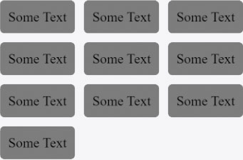
By default, when you set display of flex all the flex-items will occupy the least amount of space based on its content with the ability to shrink further down depending on the screen size. Setting these properties to the flex-item `flex-grow: 1; flex-shrink: 0;` we tell the items to increase their size if there is space but never shrink. Go ahead and try resizing the codepen. You may now notice that after setting the flex-shrink to 0 the flex-items start to overflow. But setting this property `flex-wrap: wrap;` to the `flex-display` parent will solve this issue. And as you resize the screen you notice the flex-items wrap around without you having to write any logic. See how wonderful it is! Now the size of each of the flex-items should not be the same. So, let’s set the `flex-grow` property back to 0 and you get this nice responsive layout.
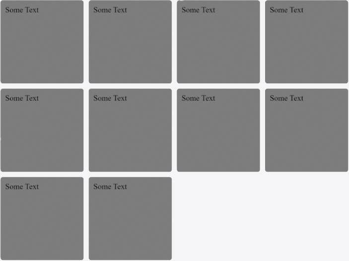
Add some width and height to the flex-items to make them larger (`width: 150px; height: 150px;`) and doesn’t that look like layout you see often on many modern websites? And it is flexible from the start so it will work on any screen size.
Now a final bit of a tip that helped me a lot while learning to use flexbox and that is using your browser. Modern browsers come with a very helpful tool when using flexbox. Go ahead and right-click on a flex item and then select Inspect (or F12) to open your browser’s DevTool. Find your parent div and you will see a nice little badge called “flex” indicating that your div is a flexbox. Click on the badge and it will nicely highlight the flex box and all its flex-items for you.
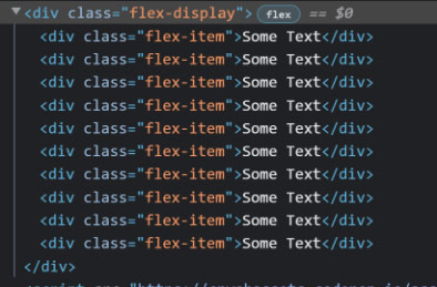
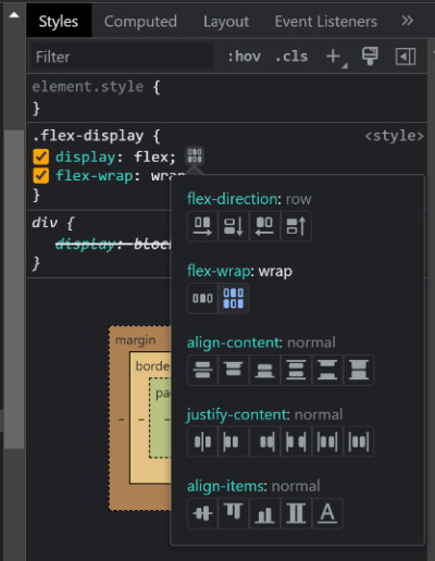
On top of that if you look on the style tab for the parent you can see another badge next to the display property. Click on that and the browser will give you a nice list of flex properties to play with and see the changes right on your browser.
Now I haven’t covered all there is to flexbox. It’s a vast topic and outside the scope of this blog. But I hope I was able to at least get you started with its concepts and encourage you to play around and discover more flex properties. Now go out in the world and flex your designs!
Topics
Keywords
- Web Design
- Web Development
- Flexbox


 Addis Enterprises LLC.


