I Need Some Space
The importance of whitespace should never be underestimated. The space you leave untouched can create BIG impact.
I Need Some Space
The importance of whitespace should never be underestimated. The space you leave untouched can create BIG impact.
When most people hear the words “I need some space”, it evokes a negative connotation pertaining to a bad relationship. But not with graphic designers. It is a relationship we covet because whitespace (also known as negative space) is our friend!
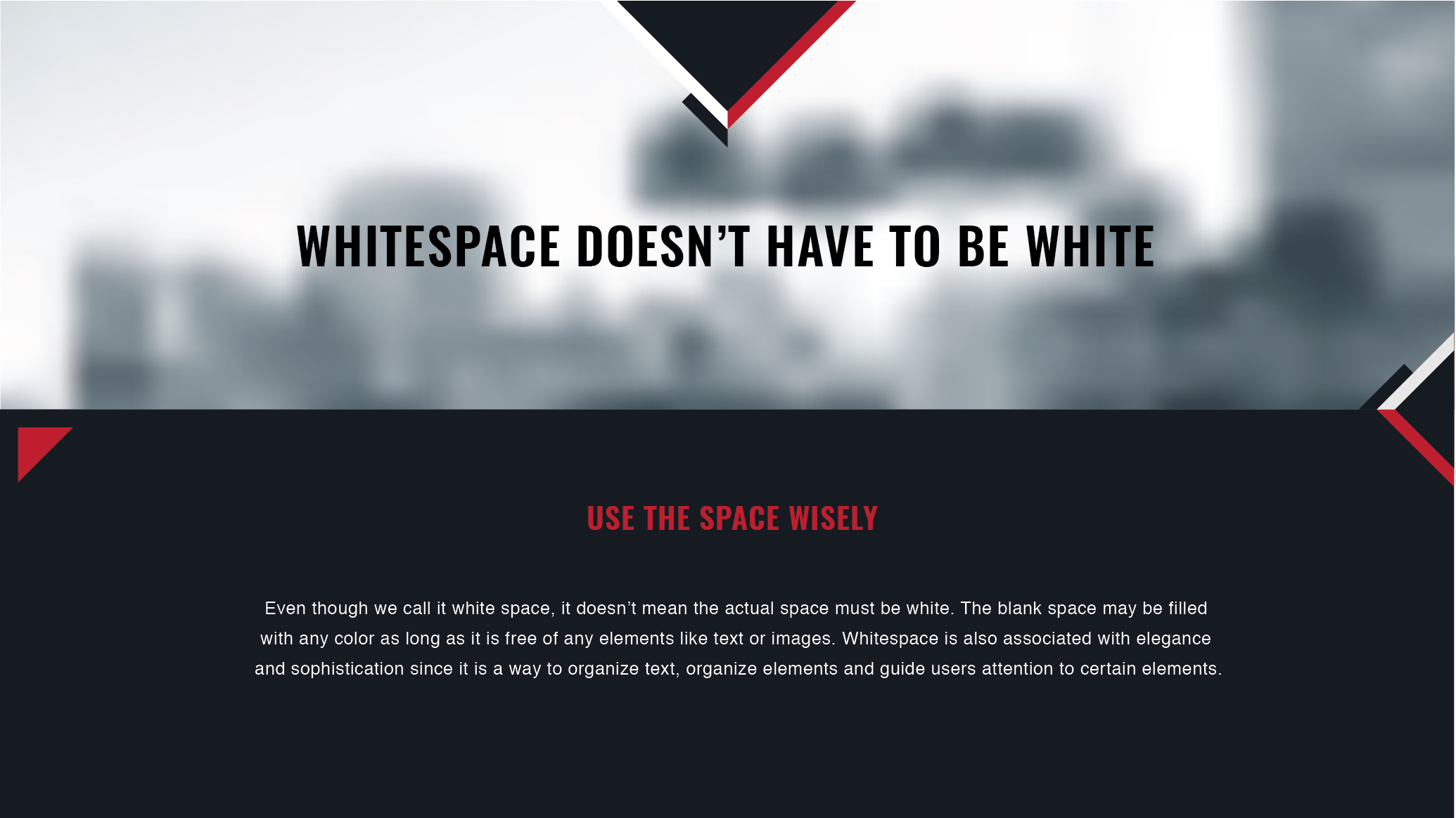
So what is whitespace? Whitespace is the space between the elements in a design layout. Space that is not filled with text, graphics or photos. Whitespace doesn’t necessarily have to be white. It can be colored, textured, or void areas in a photograph. It provides visual breathing room for the eye.

Top 4 Advantages of Whitespace
Legibility
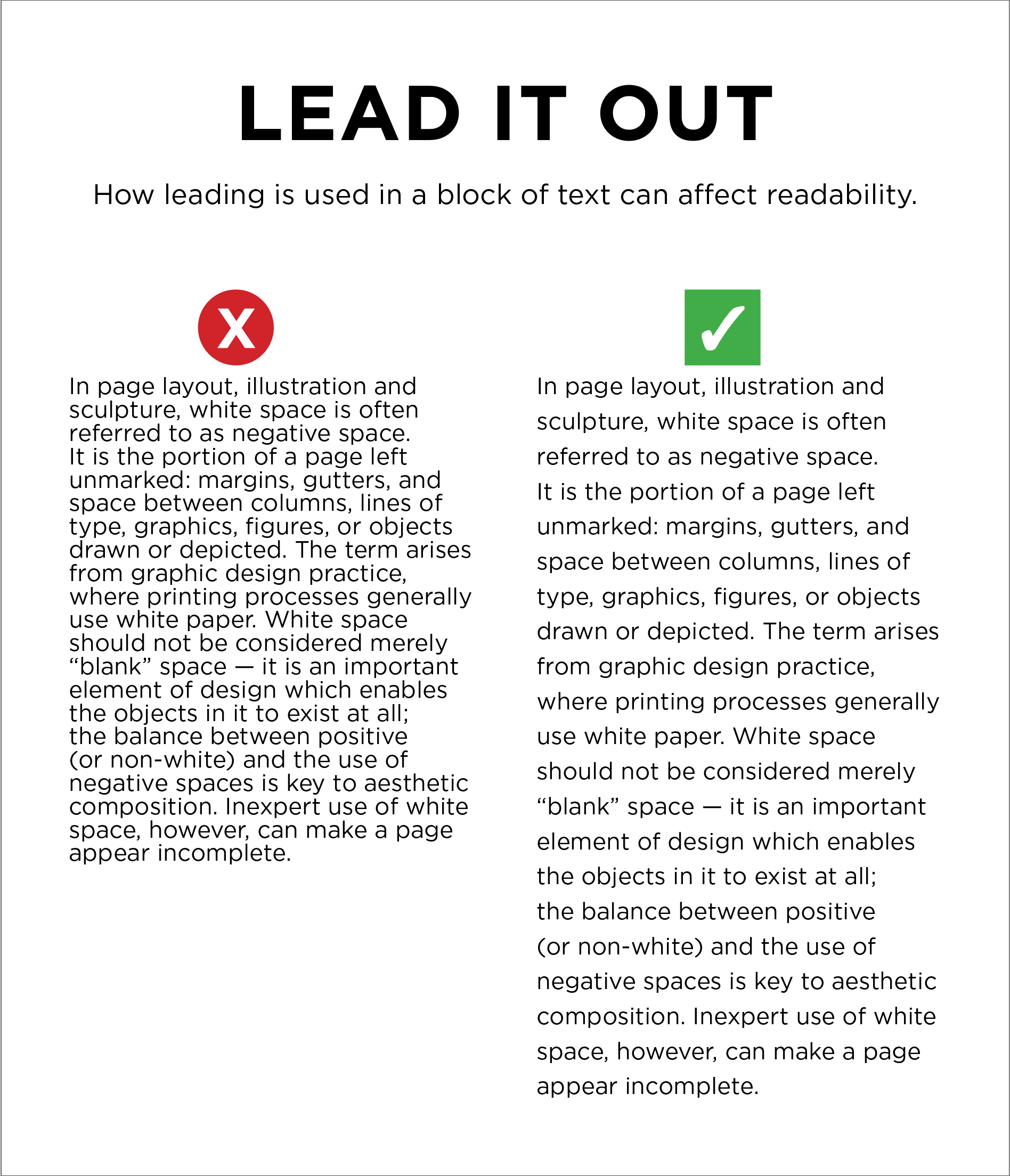
Creating paragraphs and separating text through headings and subheadings increases the readability of the content and makes it easily scannable. The reader doesn’t have to search for important information because it stands out in the design. Leading (the space between each line of text) can also be spread out to ease the readablility of the text block.

Focus
Adding space around text and graphic elements, not only create a hierarchy of those but it can also put the main focus on the most important.

Elegance
As said above, clients of think of white space as something negative but actually the opposite is true. Often, the most space that can be left unfilled, the more elegant and professional the design looks.
Balance

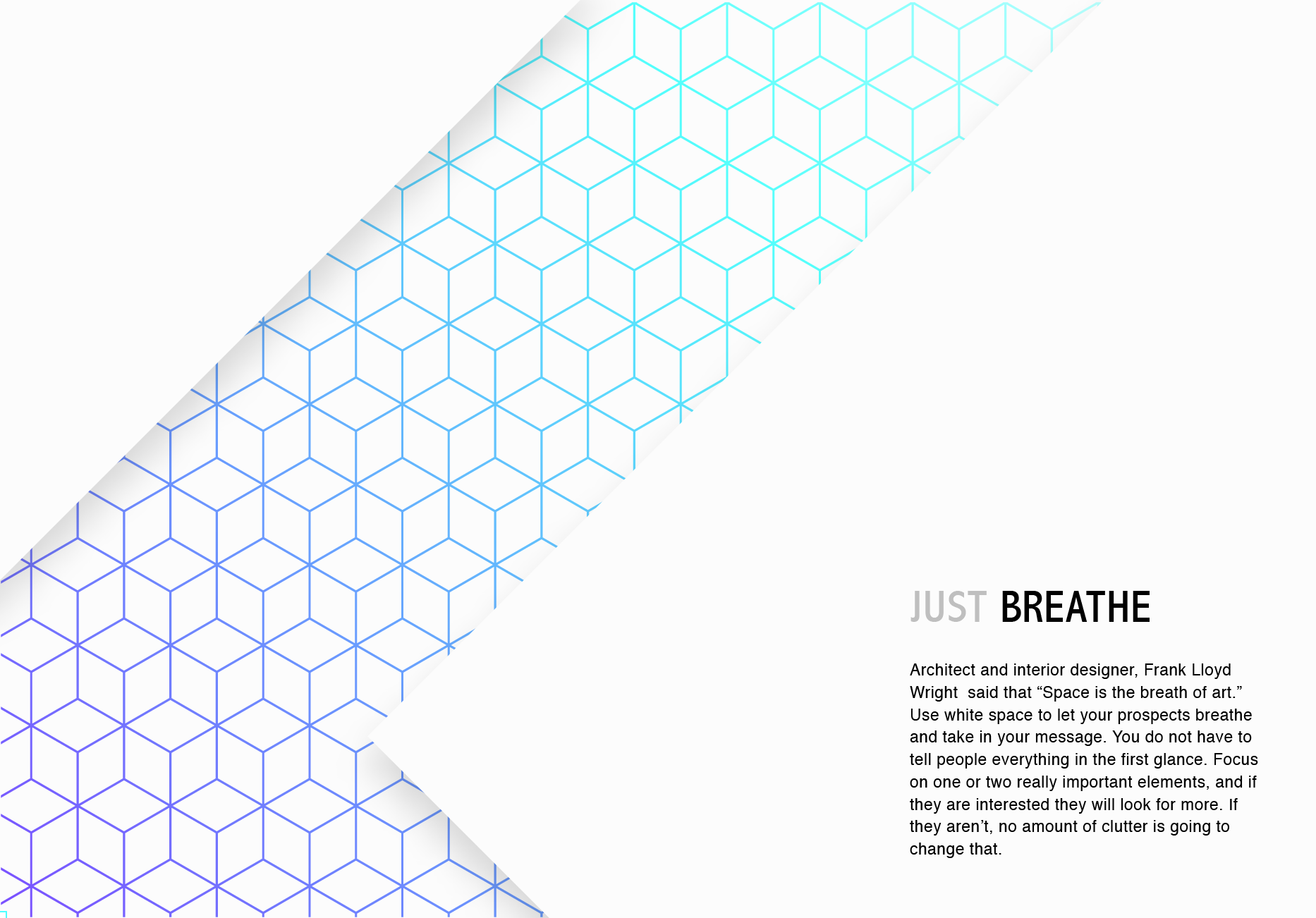
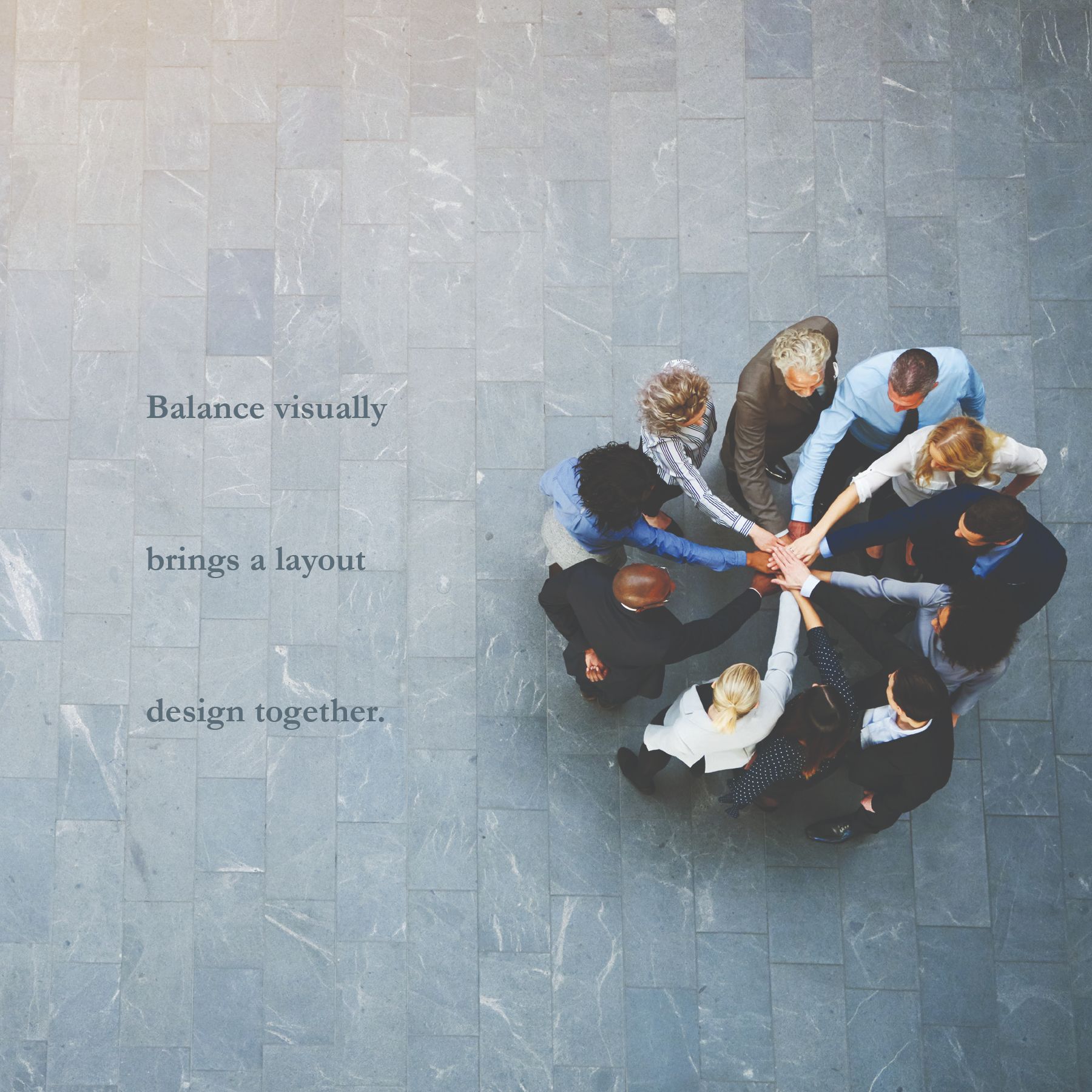
Whitespace can help communicate a message more effectively. Especially today, when everyone is bombarded with marketing everywhere, content can be easily lost in all the visual clutter. In order to stand out and allow the message to reach the proper audience, the message needs to be as concise as possible and allow whitespace to break the clutter. When whitespace is leveraged, the viewer of the piece can focus on the information you want them to receive. If there is no whitespace, the viewer gets distracted and the message gets lost.
“White space is to be regarded as an active element, not a passive background.”
– Jan Tschichold
The hardest aspect of whitespace is convincing the client that the space is a good thing. As a designer, it’s one of the most common requests from clients. “Can we add something here?” Thankfully, often when the client is shown a clean design that ‘breathes’, they see that keeping design as visually simple as possible will always yield a more powerful impact on the viewers. It cuts down on distractions and highlights only what the viewer needs to know.
(Cartoon credit: Designhill)
All in all, whitespace is just as important as any other element of a graphic design project. It provides a more intelligent organization of design layout, and at the same time it gives viewers and readers a relief from visual clutter.
So embrace whitespace as your friend. But not too tight... remember, it likes its space!
More from Jodi Miller
Keywords
- Graphic Design
- Print Media
- Print Advertising


 Addis Enterprises LLC.


